Thursday, September 2, 2010

Week 6 last blog for semester 2-Barbara Kruger

Week 6 last blog for semester 2-Barbara Kruger

Kruger’s earliest artworks date to 1969. Large woven wall hangings of yarn, beads, sequins, feathers, and ribbons, they exemplify the feminist recuperation of craft during this period. Despite her inclusion in the Whitney Biennial in 1973 and solo exhibitions at Artists Space and Fischbach Gallery, both in New York, the following two years, she was dissatisfied with her output and its detachment from her growing social and political concerns.
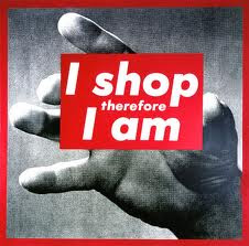
During the early 1980s Barbara Kruger perfected a signature agitprop style, using cropped, large-scale, black-and-white photographic images juxtaposed with raucous, pithy, and often ironic aphorisms, printed in Futura Bold typeface against black, white, or deep red text bars. The inclusion of personal pronouns in works like Untitled (Your Gaze Hits the Side of My Face) (1981) and Untitled (I Shop Therefore I Am) (1987) implicates viewers by confounding any clear notion of who is speaking.

imgres.jpgimgres.jpg

In these installation works Barbara Kruger transferred words and images directly to the surfaces of the gallery. Each installation featured a text written on the floor in white type on a red ground.
With a directness that is characteristic of Kruger's work, the text addresses the viewer's sense of certainty with the world. In Kruger's installations the floor now has a voice, the walls can hear you, and the architecture is manipulating the way you speak.
Kruger uses The colour red to create a strong impact, she also uses word's like 'YOU' and 'US' so that the reader is included in the works and knows who is speaking.

Kruger is a well-known graphic designer from the 1980s whose work primarily focused on social activism. Kruger had a distinct style, juxtaposing found photographs with strong declarative slogans – composing a language of art and protest. Her most well known piece, Your Body is a Battleground, epitomizes her style. The poster consist of a black and white photograph of a woman’s face, split down the middle, with one half of the photograph’s color inverted.

Placed across her face in white Futura bold italic and a red text box reads ‘Your body is a battleground.’ Most of Kruger’s work explored the dynamics of gender and social power in American society. The piece is reminiscent of Peter Gee’s poster Dr. Martin Luther King from 1968. The central axis of the poster uses a positive and negative dichotomy, which was inspiration for Kruger’s poster. Her posters along with Gee’s and other postmodernist designers of the 1980s employed bold statements that attacked the viewer.

Week 5 - Kehinde Wiley

Week 5 - Kehinde Wiley

kehinde-41.jpgwiley_01.jpgartwork_images_424078385_428826_kehinde-wiley.jpg114_001.jpeg

Kehinde Wiley (born in Los Angeles, California in 1977) is a New York based painter who is known for his paintings of contemporary urban African American men in poses taken from the annals of art history. His painting style has been compared to that of such traditional portraitists as Reynolds, Gainsborough, Titian and Ingres. The Columbus Museum of Art, which hosted an exhibition of his work in 2007, describes his work with the following: "Kehinde Wiley has gained recent acclaim for his heroic portraits which address the image and status of young African-American men in contemporary culture."

Wiley takes it further by over-accentuating the feminine qualities of the traditionally masculine strength within old European art. He explains, “As a culture, we have in some ways codified the decorative as belonging to the feminine. And I am depicting young black men who are perceived as being hyper-sexual with a propensity toward sports and anti-social behavior. These things are codified as being very masculine and by juxtaposing that with something that is seen as being feminine, I think we sort of blast through both. A type of supernova that lays bare the absurdity of these codes to begin with.”
His portraits are based on photographs of young men who Wiley sees on the street, begun last year with men mostly from Harlem’s 125th Street, the series now includes models from the South Central neighborhood where he was born. Dressed in street clothes, they are asked to assume poses from the paintings of Renaissance masters, such as Titian and Tiepolo. Wiley also embraces French rococo ornamentation; his references to this style complement his embrace of hip–hop culture. Similarly, the poses of his figures appear to derive as much from contemporary hip–hop culture as from Renaissance paintings.

I find it really interesting that he paints black men and then surrounding them this sort of victorian look. Which is not what you think of when you think 'victorian', i usually think...White female?. Also the men are wearing 'street clothes' which is totally odd when you have those surroundings.
The paintings are good paintings, but it doesn't really appeal to me I don't really like them particularly.

Week 4- Anish Kapoor

Week 4- Anish Kapoor

DownloadedFile-2.jpegDownloadedFile-1.jpegDownloadedFile.jpeg

pieces are frequently simple, curved forms, usually monochromatic and brightly coloured. Most often, the intention is to engage the viewer, producing awe through their size and simple beauty, evoking mystery through the works' dark cavities, tactility through their inviting surfaces, and fascination through their reflective facades. His early pieces rely on powder pigment to cover the works and the floor around them. Such use of pigment characterised his first high profile exhibit as part of the New Sculpture exhibition at the Hayward Gallery London in 1978. This practice was inspired by the mounds of brightly coloured pigment in the markets and temples of India (picture #1). His later works are made of solid (picture #2), quarried stone, many of which have carved apertures and cavities, often alluding to, and playing with, dualities (earth-sky, matter-spirit, lightness-darkness, visible-invisible, conscious-unconscious, male-female and body-mind). His most recent works are mirror-like, reflecting or distorting the viewer and surroundings (picture #3). The use of red wax is also part of his current repertoire, evocative of flesh, blood and transfiguration.


“The Farm,” a 400ha (1,000 acre) private estate outdoor art gallery in Kaipara Bay, north of Auckland, New Zealand. Kapoor’s first outdoor sculpture in fabric, “The Farm” (the sculpture is named after its site), is designed to withstand the high winds that blow inland from the Tasman Sea off the northwest coast of New Zealand’s North Island. The sculpture is fabricated in a custom deep red PVC-coated polyester fabric by Ferrari Textiles supported by two identical matching red structural steel ellipses that weigh 42,750kg each. The fabric alone weighs 7,200kg.
The ellipses are orientated one horizontal, the other vertical. Thirty-two longitudinal mono-filament cables provide displacement and deflection resistance to the wind loads while assisting with the fabric transition from horizontal ellipse, to a perfect circle at midspan, through to the vertical ellipse at the other end. The sculpture, which passes through a carefully cut hillside, provides a kaleidoscopic view of the beautiful Kaipara Harbor at the vertical ellipse end and the hand contoured rolling valleys and hills of “The Farm” from the horizontal ellipse.

imgres.jpg

I think this sculpture is my favorite of Kapoor's work. I'm not really too sure why though, I think i must just be visually attracted to how it is reflective....? I also love how you can walk underneath it, that's awesome. It creates a sort of fisheye view of the surroundings behind you. Fisheye cameras are so fun to play with. Even though i have said that this is m fav, I just wanted to say that i like the way he uses the colour red a lot, very eye catching!